Set up your Figma file
Here are some useful tips for efficiently organizing your Figma file to ensure easy access and a well-structured layout. This will help both our UX team and the rest of our team navigate quickly and effectively.
Put your file in the right place
- Create your new file in the appropriate folder with a descriptive name if that's the existing client.
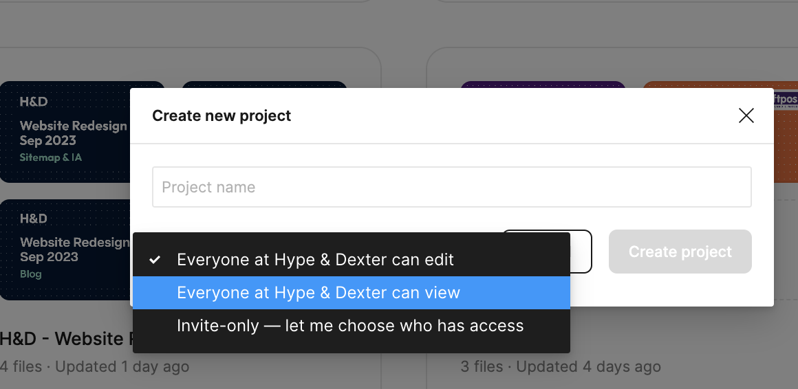
- For new clients, create a new Project within the 'H&D team' folder. Use the format {3 or 6 Client Code} | 'Client name' for both the folder and individual files.
For example, CLP001 | ClearPoint, CLP001 | Wireframe - Make sure that the new project is set for all H&D team members to View only, not Edit access. We can always adjust the permission settings later if required.

Create and set your Project's cover thumbnail
The cover thumbnail will provide a quick and informative overview of the project. Consider including this information:
|
|
Organising Your File
Well-structured files can save a lot of time in finding things
- Categorise your file structure: Gather all of your relevant elements on a single page to enhance organisation and improve efficiency. E.g. Component, Style guide, Icon, Illustration...
- Note: Ensure to review your component libraries to see if there is an existing one or if any essential ones are enabled.

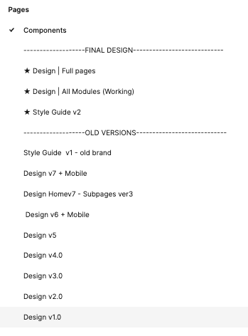
- Naming Convention: Clearly label the version, separate old versions into their own section, and organise the latest versions in different areas.
- Use separator or divider: You can add an empty page and label it with a series of dashes to create a visual divider (please see examples down below). To make it easier to find files, it would be beneficial to label sections such as Final Design, Playground, and Archived...

Note: As of the time this article was published, Figma does not support managing comments through versions. This means that if you move elements within the file, comments may become disorganised, floating around, and lose their context.
To avoid this issue, duplicate your files and name them with a version number when working on iterations. This allows you to track back the feedback and manage versions of the file more effectively. It also provides the ability to revert to previous versions if needed (which happens frequently).
Set up your local document styles
This is highly recommended to maintain consistency and make future maintenance and updates in the file and also help the design elements remain cohesive and aligned throughout the project. Here are a couple of notes:- Typography:
- Follow the client's brand guidelines to set up the typo, but also consider checking how they're implemented on their website. This ensures that your design aligns with their established identity and maintains a cohesive visual experience.
- For the wireframe, system fonts are recommended in this early stage of the project (we're currently using Poppin, but you're welcome to use any other system font).
This allows our team members (non-designers) be able to update/modify the wireframe without installing custom fonts. - Ensure that the essential typography pack (i.e. headings and body text) has been set up. You can finalise the typography in later stages of the project.
- Colours: Set up primary and accent colours if brand guidelines are provided. Otherwise, you can reference essential colours based on their website.
- The shade of Greys: This is optional, but highly recommended (by our Devs) to ensure a consistent shade of greys throughout the design.
- Grid and guideline: A grid or guidelines help in creating a consistent and visually appealing design so we recommend setting them up in the early stage.
- Other elements: Having other elements such as icons, button styles, and illustrations set up in your file can be incredibly useful, even if they are just placeholders.
Sharing Your File
- If your file consists of multiple pages, it is recommended to assign a unique flow to each page and share a list of pages instead of one link containing all. This approach is based on our past experiences where clients may not be familiar with navigating through pages in the prototype.
- When sharing the file with the client, the approach may vary depending on the situation. As a general practice, it is recommended to share only the prototype - set the link to public access with a password so that clients without a Figma account can still view it. However, please note if the client wants to provide feedback and comment on the file, they will need to sign up for a free Figma account.
- If the client requests to share the working file, it is recommended to clone the file and name it "Client Shared" to ensure that only the necessary parts are shared with the client. This helps to maintain our confidentiality and protect sensitive information.
This article will be continuously updated to reflect any improvements we discover in our process. If you have any uncertainties or suggestions for doing things differently, please raise them with our team for further discussion and collaboration to enhance our workflow.
